


None
Most users ever online was 387 on Tue Dec 05, 2023 7:35 pm

The newest registered user is Skylines3
Our users have posted a total of 47502 messages in 4941 subjects
| No user |
• The FREE hand reading services at the Modern Hand Reading Forum are being continued in 2019 with the assistance of Google adsense!

Learn how to read hands according the Modern Hand Reading paradigm & you can use this forum as your palm reading guide!
A new 'skin' for HandResearch.com!
Modern Hand Reading Forum - Discover the language of your hands: palm reading & palmistry forum! :: VIIIa - Basket... introduce topics that do not relate to hands! :: VIIIb - Thought of the day...

A new 'skin' for HandResearch.com!
![]() Martijn (admin) Fri Jul 22, 2011 3:22 am
Martijn (admin) Fri Jul 22, 2011 3:22 am
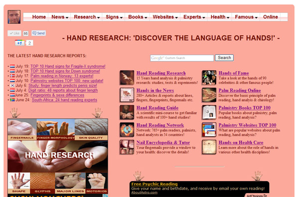
I have developed a new modern skin for HandResearch.com - including a brand new drop-down navigation menu (featured with links to about 80 different sections of my website).
See: www.handresearch.com
Myself, I like it a lot ... (
 ) ... but I would like to hear the opinion of others!!
Do you like it?
(And would you consider it as an improvement compared to the old navigation menu?)

Martijn (admin)- Admin
- Posts : 5261
Join date : 2010-07-23
Location : The Netherlands -

Re: A new 'skin' for HandResearch.com!
![]() Lynn Fri Jul 22, 2011 11:13 am
Lynn Fri Jul 22, 2011 11:13 am

(I have been working on a make-over and drop-down menu for my site too, but it is taking me ages to do it!)

Lynn- Posts : 2464
Join date : 2010-07-24
Location : Devon, England -
Re: A new 'skin' for HandResearch.com!
![]() waqar.an Fri Jul 22, 2011 11:39 am
waqar.an Fri Jul 22, 2011 11:39 am
Your website and also this forum is great as far as content is considered. However look and feel and usability are bit amateurish and need serious and professional redesigning.

waqar.an- Posts : 214
Join date : 2011-06-04
Age : 46
Location : Edmonton, AB, Canada -
Re: A new 'skin' for HandResearch.com!
![]() jeanette Fri Jul 22, 2011 1:00 pm
jeanette Fri Jul 22, 2011 1:00 pm
jeanette- Posts : 568
Join date : 2010-07-27
Location : scotland
Re: A new 'skin' for HandResearch.com!
![]() Martijn (admin) Fri Jul 22, 2011 2:30 pm
Martijn (admin) Fri Jul 22, 2011 2:30 pm
Hello Lynn & Jeanette,
Great to hear that you perceive the new navigation menu is an improvement!

Martijn (admin)- Admin
- Posts : 5261
Join date : 2010-07-23
Location : The Netherlands -
Re: A new 'skin' for HandResearch.com!
![]() Martijn (admin) Fri Jul 22, 2011 2:33 pm
Martijn (admin) Fri Jul 22, 2011 2:33 pm
waqar.an wrote:hi Martijn;
Your website and also this forum is great as far as content is considered. However look and feel and usability are bit amateurish and need serious and professional redesigning.
Hi waqar.an,
Thanks for sharing your thoughts.
But your feedback does not include any clue about what specific aspect you have in mind - actually, it sounds a bit like as if your thought are not the result of the new homepage.
(Maybe your thoughts were induced by the other pages???)
Martijn (admin)- Admin
- Posts : 5261
Join date : 2010-07-23
Location : The Netherlands -
Re: A new 'skin' for HandResearch.com!
![]() Martijn (admin) Fri Jul 22, 2011 7:10 pm
Martijn (admin) Fri Jul 22, 2011 7:10 pm
... Just finished the update of the 'famous hands' section - which is now featured with the news skin (incl. the hands of 90+ famous persons):
http://www.handresearch.com/hands-of-fame.htm

Martijn (admin)- Admin
- Posts : 5261
Join date : 2010-07-23
Location : The Netherlands -
Re: A new 'skin' for HandResearch.com!
![]() waqar.an Fri Jul 22, 2011 7:59 pm
waqar.an Fri Jul 22, 2011 7:59 pm
hi Martijn;Martijn (admin) wrote:But your feedback does not include any clue about what specific aspect you have in mind - actually, it sounds a bit like as if your thought are not the result of the new homepage.
(Maybe your thoughts were induced by the other pages???)
I think i overgeneralize my response or may be it was the pinkish color of the website made me think amateurish....
There are new trend in the web designing right now and may be following article well describe what i am seeing on thoroughly designed websites.
http://webdesignledger.com/tips/web-design-trends-in-2011
It include the creative artwork, color scheme, touch screen ready, integration with social networking websites, RSS streams and other nitty gritty.
Also you are using PHPBB for the forum which I think is older version because new version is very different. There are redundancy in your website and forum. Forum should have been included in the main website and website address should be same for your main website and the forum. Actually forum should be forum.handresearch.com and there should not be redundancy in website articles and forum content. I have noticed people responding to your blogs and website and forum on the same article which is not tidy. Also I am not able to find forum link in the drop down menu.
waqar.an- Posts : 214
Join date : 2011-06-04
Age : 46
Location : Edmonton, AB, Canada -
Re: A new 'skin' for HandResearch.com!
![]() Lynn Sat Jul 23, 2011 1:48 am
Lynn Sat Jul 23, 2011 1:48 am
waqar.an wrote:or may be it was the pinkish color of the website made me think amateurish.....

this made me laugh (sorry Martijn! ;-) ). MANY years ago...I am guessing more than 10 years?... when Martijn first showed me his new website (I think back then it was called "hand-in-hand") my comment was something like - "the content is great but I don't like the salmon colour, it is too pink"! (Martijn do you remember it?!)
waqar, thank you for the link about website design.

Lynn- Posts : 2464
Join date : 2010-07-24
Location : Devon, England -
Re: A new 'skin' for HandResearch.com!
![]() Martijn (admin) Sun Jul 24, 2011 1:40 am
Martijn (admin) Sun Jul 24, 2011 1:40 am
waqar.an wrote:hi Martijn;
I think i overgeneralize my response or may be it was the pinkish color of the website made me think amateurish....
Okay, thanks - I am glad to hear that you have noticed at least some of the the improvement.
Sorry, I think changing the 'skin-like' colour would not create any real improvement - simply because I think people have different perceptions about any colour (it would take far too much time to change all pictures involved and I doubt if that would really result in any significant improvement for all users).
PS. Your other comments go beyond the changes that I have implemented; e.g. this forum is not a subsection of my website because this forum is an open platform with a much wider purpose than my own interest, etc.
Martijn (admin)- Admin
- Posts : 5261
Join date : 2010-07-23
Location : The Netherlands -
Re: A new 'skin' for HandResearch.com!
![]() Martijn (admin) Sun Jul 24, 2011 1:49 am
Martijn (admin) Sun Jul 24, 2011 1:49 am
Lynn wrote:waqar.an wrote:or may be it was the pinkish color of the website made me think amateurish....
this made me laugh (sorry Martijn! ;-) ). MANY years ago...I am guessing more than 10 years?... when Martijn first showed me his new website (I think back then it was called "hand-in-hand") my comment was something like - "the content is great but I don't like the salmon colour, it is too pink"! (Martijn do you remember it?!)
waqar, thank you for the link about website design.
Hi Lynn, yes I remember.
(See my former comment - sorry, my website is far too 'amateurish' to imply a color change since I can oversee the implications for the 2000 pages, because I have experimented with lots of images that have been integrated with the background colour on many pages. So a colour change - instead of the 'skin-colour' - is no option).
Martijn (admin)- Admin
- Posts : 5261
Join date : 2010-07-23
Location : The Netherlands -
Re: A new 'skin' for HandResearch.com!
![]() Patti Sun Jul 24, 2011 2:13 am
Patti Sun Jul 24, 2011 2:13 am
Martijn (admin) wrote:
I have developed a new modern skin for HandResearch.com - including a brand new drop-down navigation menu (featured with links to about 80 different sections of my website).
See: www.handresearch.com
Myself, I like it a lot ... (
Do you like it?
(And would you consider it as an improvement compared to the old navigation menu?)
I like the drop down box feature. When you scroll over the word signs, facebook and like, come up as the top layer and hides some of the list items. (in case you hadn't noticed - and maybe it's just my monitor)

Patti- Posts : 3912
Join date : 2010-07-24
Re: A new 'skin' for HandResearch.com!
![]() Martijn (admin) Sun Jul 24, 2011 2:22 am
Martijn (admin) Sun Jul 24, 2011 2:22 am
Patti wrote:Martijn (admin) wrote:
I have developed a new modern skin for HandResearch.com - including a brand new drop-down navigation menu (featured with links to about 80 different sections of my website).
See: www.handresearch.com
Myself, I like it a lot ... (
Do you like it?
(And would you consider it as an improvement compared to the old navigation menu?)
I like the drop down box feature. When you scroll over the word signs, facebook and like, come up as the top layer and hides some of the list items. (in case you hadn't noticed - and maybe it's just my monitor)
Yes Patti, I have noticed the problem as well... it appears to manifest only with the buttons that I have taken from Facebook. But the problem doesn't manifest if I use buttons from other sources (which I have started to adopt in the 'hands in the news section').
So, I expect that soon I will be able to deal with that problem permanently.
Martijn (admin)- Admin
- Posts : 5261
Join date : 2010-07-23
Location : The Netherlands -
Re: A new 'skin' for HandResearch.com!
![]() waqar.an Sun Jul 24, 2011 6:07 am
waqar.an Sun Jul 24, 2011 6:07 am
Martijn (admin) wrote:Okay, thanks - I am glad to hear that you have noticed at least some of the the improvement.
There is some consensus about white space among professionals. Please have a look here:Martijn (admin) wrote:
Sorry, I think changing the 'skin-like' colour would not create any real improvement - simply because I think people have different perceptions about any colour[/color]
http://naldzgraphics.net/design-2/11-reasons-why-white-spaces-are-good-in-graphic-design/
Also colors and spaces create the space of reference and shape the structure of learning.
These things effect fast unconsciously before we even notice it. We usually only come to know after much research.
Good to know that.Martijn (admin) wrote:
PS. Your other comments go beyond the changes that I have implemented; e.g. this forum is not a subsection of my website because this forum is an open platform with a much wider purpose than my own interest, etc.[/color]
You are welcome Lynn.Lynn wrote:waqar, thank you for the link about website design.

waqar.an- Posts : 214
Join date : 2011-06-04
Age : 46
Location : Edmonton, AB, Canada -
Re: A new 'skin' for HandResearch.com!
![]() Lynn Sun Jul 24, 2011 9:42 am
Lynn Sun Jul 24, 2011 9:42 am
Martijn (admin) wrote:Hi Lynn, yes I remember.
(See my former comment - sorry, my website is far too 'amateurish' to imply a color change since I can oversee the implications for the 2000 pages, because I have experimented with lots of images that have been integrated with the background colour on many pages. So a colour change - instead of the 'skin-colour' - is no option).
HI Martijn, sorry - I wasn't suggesting that you change the colour. I was just amused to remember my first comment to you many years ago
Since you first created the site there have been many trends in webdesign, which soon go out of fashion. You have focussed on creating interesting and useful content, research & info - which interests me much more than what colour it is! You have expanded it into a huge resource, and are also excellent at getting your site to the top of google etc. Because it got so big, it was becoming difficult to navigate, so I think you've done a great job with the new front page layout, drop-down menu bar etc, it's much clearer and easier to find things.
Lynn- Posts : 2464
Join date : 2010-07-24
Location : Devon, England -
Re: A new 'skin' for HandResearch.com!
![]() Martijn (admin) Sun Jul 24, 2011 10:40 am
Martijn (admin) Sun Jul 24, 2011 10:40 am
Hi Lynn, thanks for explaining your thoughts once more.
Yes, I as well think that the 'skin-colour' is one of the aspects which discriminates my HandResearch.com from other websites. So that is indeed the other side of this skin-coloured coin...
Martijn (admin)- Admin
- Posts : 5261
Join date : 2010-07-23
Location : The Netherlands -
Re: A new 'skin' for HandResearch.com!
![]() Martijn (admin) Sun Jul 24, 2011 2:50 pm
Martijn (admin) Sun Jul 24, 2011 2:50 pm
Patti wrote:
I like the drop down box feature. When you scroll over the word signs, facebook and like, come up as the top layer and hides some of the list items. (in case you hadn't noticed - and maybe it's just my monitor)
... Problem solved!
Martijn (admin)- Admin
- Posts : 5261
Join date : 2010-07-23
Location : The Netherlands -
Re: A new 'skin' for HandResearch.com!
![]() Martijn (admin) Sun Jul 24, 2011 8:37 pm
Martijn (admin) Sun Jul 24, 2011 8:37 pm
waqar.an wrote:... Also I am not able to find forum link in the drop down menu.
Hello waqar.an,
Yes, that's correct: a link to the forum is now present at the bottom menu of every page updated with the new skin (next to a link to my new 'Multi-Perspective Palm Reading' website).
I hope this makes sense after I explained that the forum has a different purpose.
Martijn (admin)- Admin
- Posts : 5261
Join date : 2010-07-23
Location : The Netherlands -
Re: A new 'skin' for HandResearch.com!
![]() waqar.an Sun Jul 24, 2011 8:46 pm
waqar.an Sun Jul 24, 2011 8:46 pm
hi Martijn;Martijn (admin) wrote:a link to the forum is now present at the bottom menu of every page updated with the new skin (next to a link to my new 'Multi-Perspective Palm Reading' website).
Thanks for considering my indication.
waqar.an- Posts : 214
Join date : 2011-06-04
Age : 46
Location : Edmonton, AB, Canada -
» DENZEL WASHINGTON'S HANDS - Incl. impressions from his pinky finger!
» ARTICLE: 'Relationship between palmar skin creases and osseous anatomy'
Modern Hand Reading Forum - Discover the language of your hands: palm reading & palmistry forum! :: VIIIa - Basket... introduce topics that do not relate to hands! :: VIIIb - Thought of the day...
» Teacher square on my Jupiter mount
» Handreading International Conference 2024
» Can anyone read it for me?
» Are there any signs in the hands that you are a twin flame?
» Square on Marriage line
» Cross in mount Jupiter
» clinodactyly: top phalanges bending towards Mercury finger
» Can anybody please read this hand
» Nisha Ghai
» Absolutely non-sense career till now
» Fate Destiny Line -
» VIII - Palmistry books TOP 100 - listed by 'Amazon Sales Rank'!
» Stewart Culin - Palmistry in China and Japan
» Herbert Giles - Palmistry in China